AMUT TUMA
Wall paintings in an outbuilding of a former hospital / acrylic on walls / (2x) 334 x 548 cm
Location: outLINE, Amsterdam - 07.05.06 till 02.06.06
EN
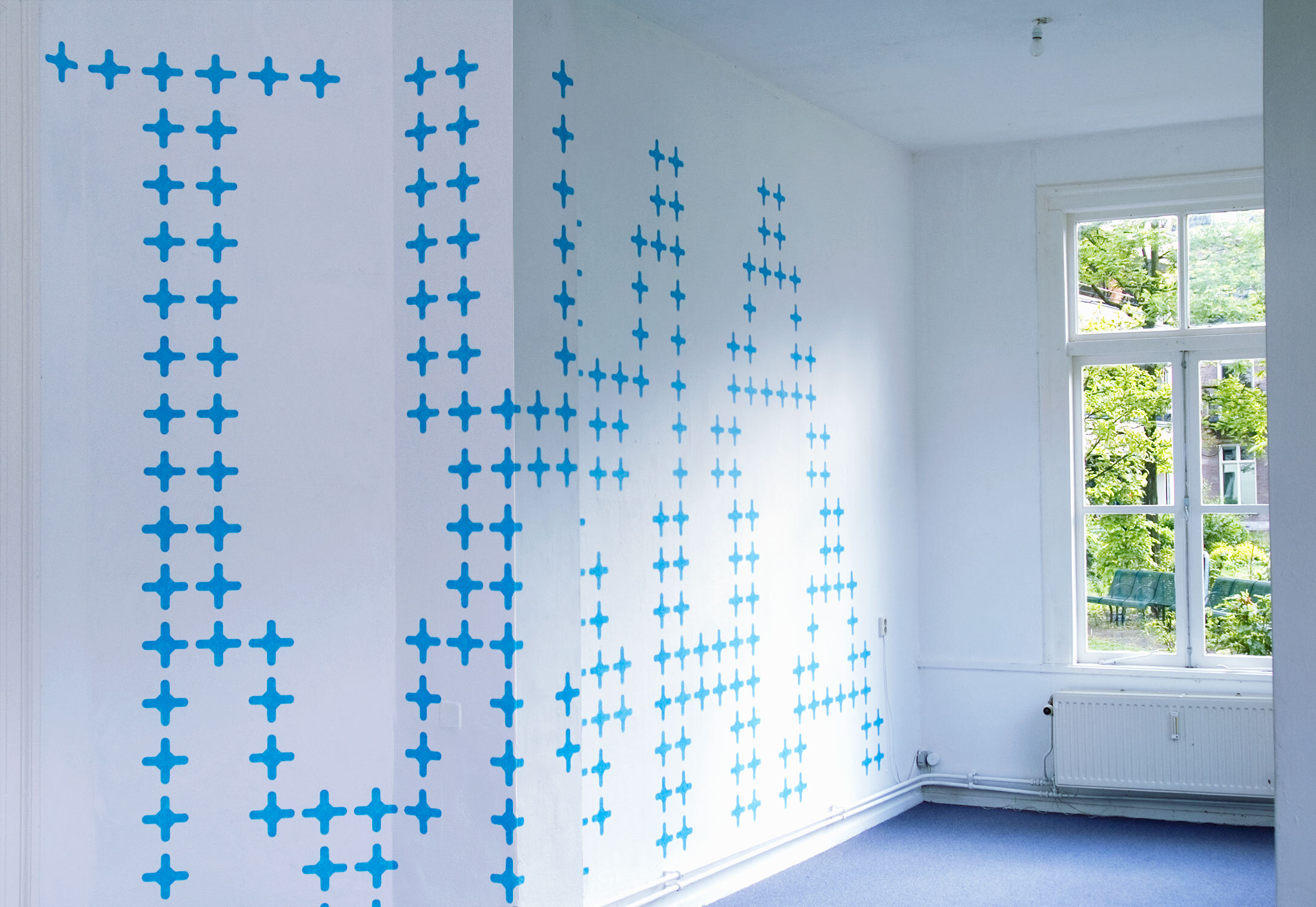
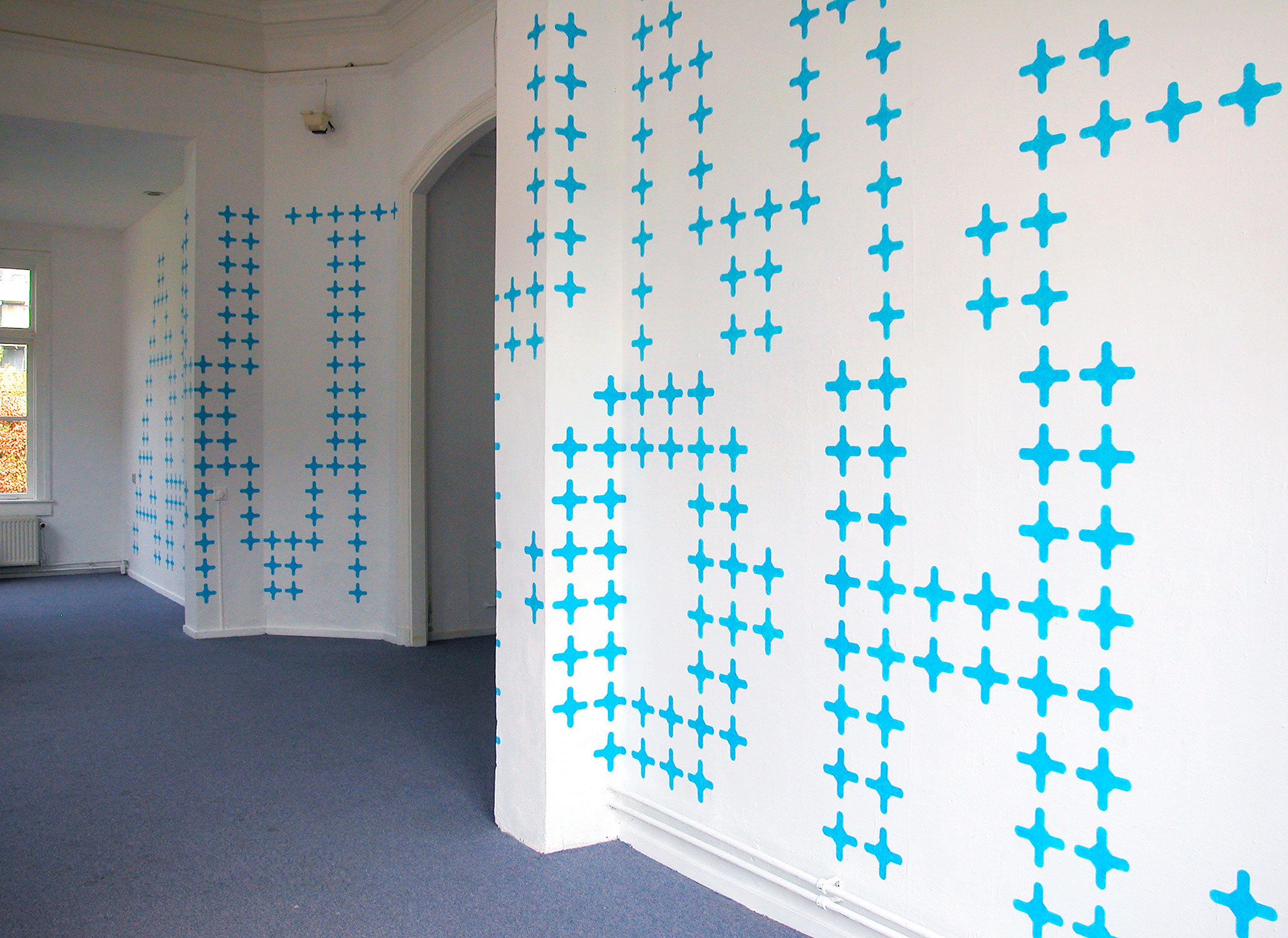
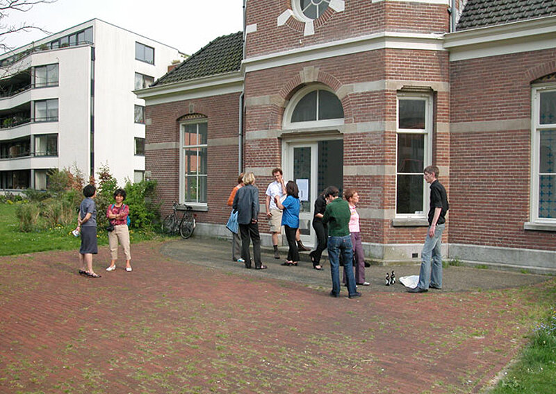
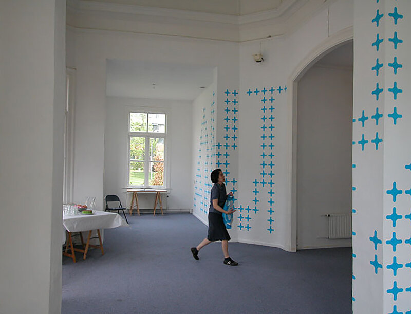
The outLINE Foundation is an artists’ initiative situated in an 18th century, garden pavilion of a former hospital in East Amsterdam. The floor plan is cross-shaped with above its intersection, a small dome. The chapel-like atmosphere sets you in a contemplative and tranquil mood. I’d taken the notion, or rather - the longing for a sanctuary amidst the hectic of a city - as a starting point for this installation.
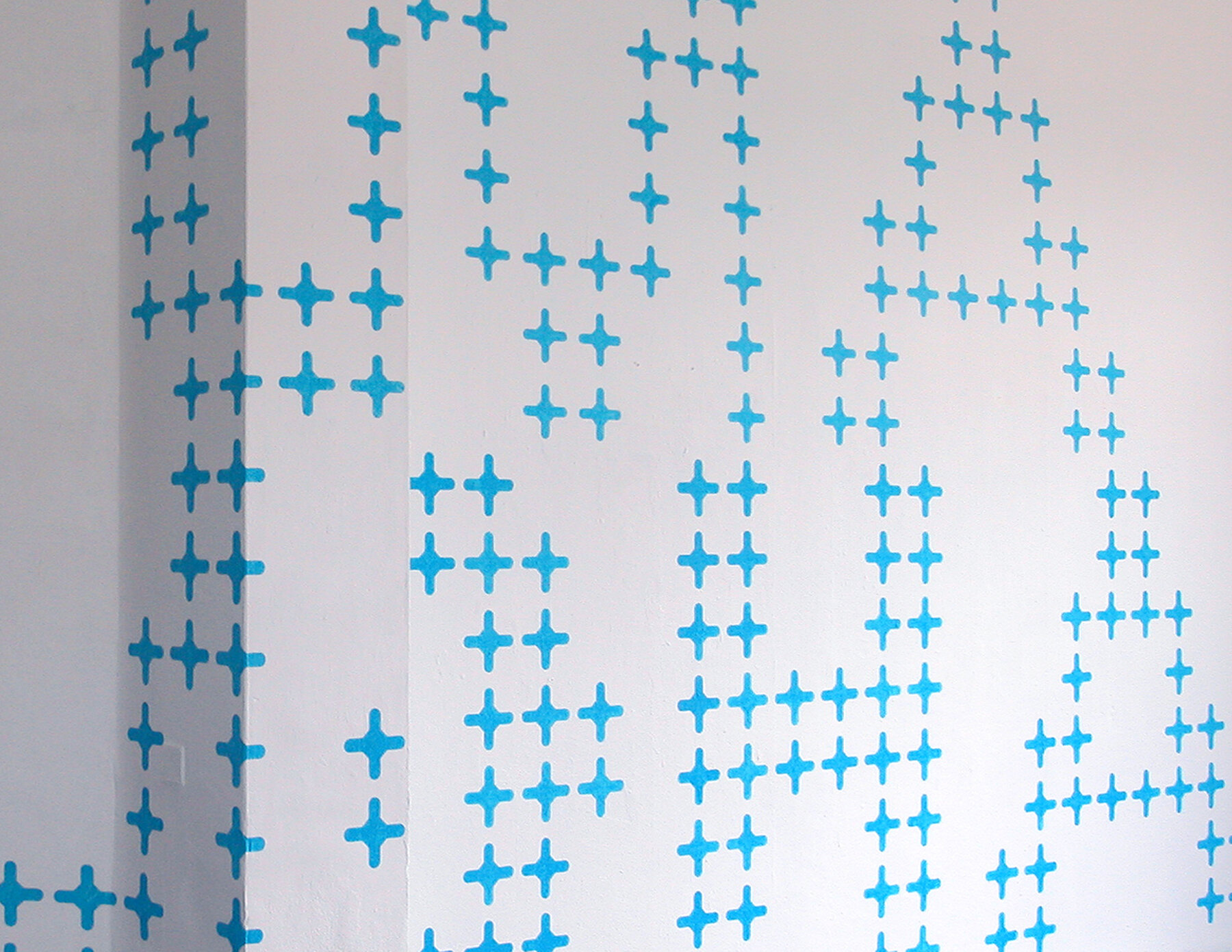
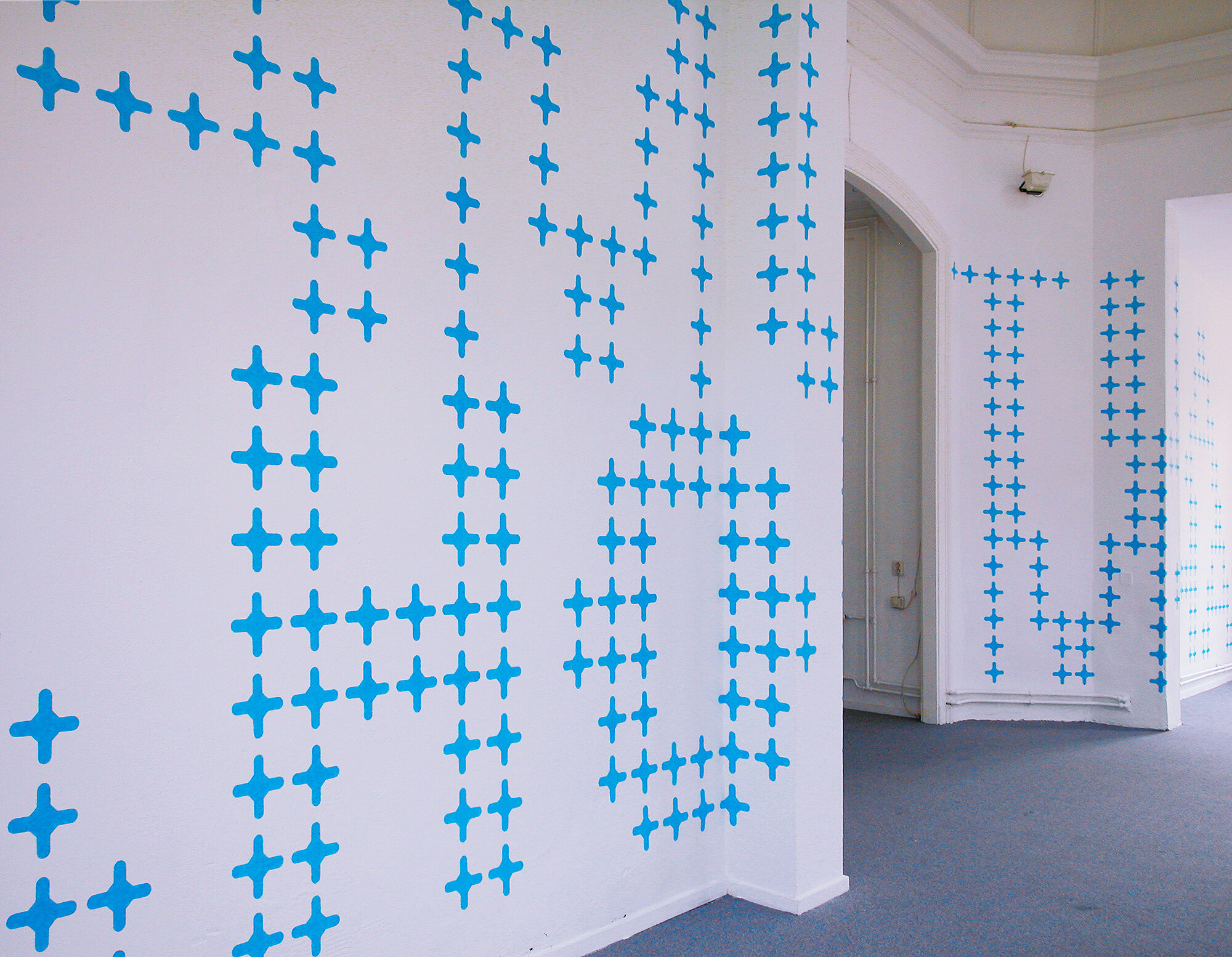
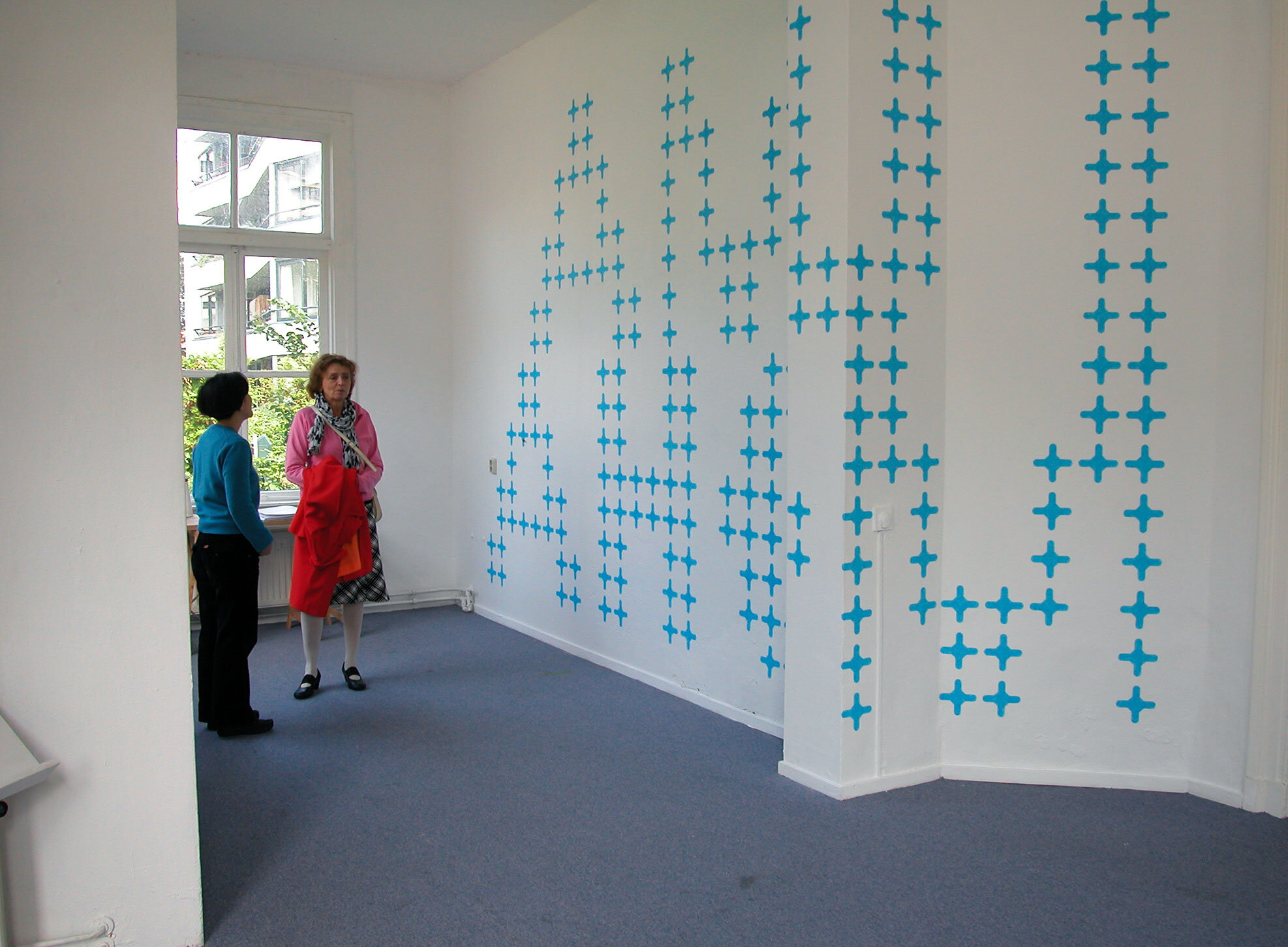
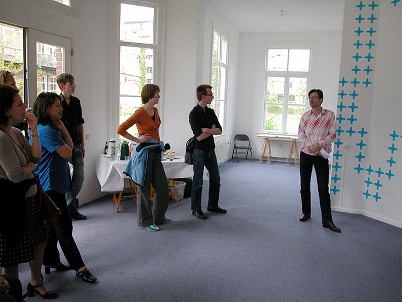
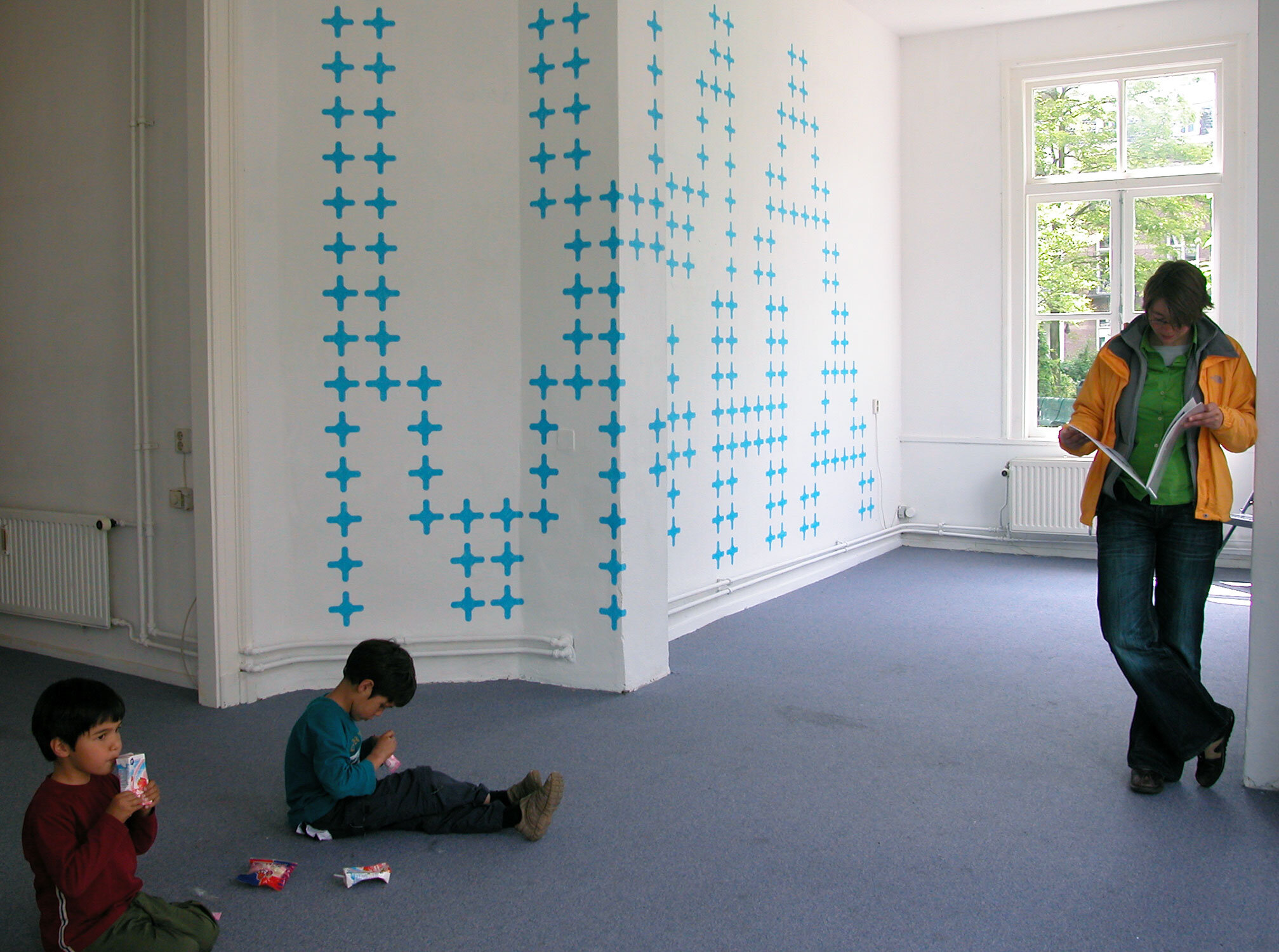
The mural consisted of 516 hand-painted, 16 x 16 cm cross-forms build-up out of transparent layers of sky blue paint; spread over the right and left wings of the pavilion. The crosses formed the made-up palindromes AMUTTUMA and AHOMMOHA, and were a soothing whisper resonating back and forth through the space. The spatial properties of language and the visual quality of signage were reoccurring themes especially in the earlier works. For AMUT TUMA a new aspect to her method of working is introduced by approaching the subject typographically. The font she developed for this project increased in legibility the further away you stood from the piece. This same tension between language and imagine was also evident in a two small-scale editions she’d made for the exhibition.
NL
Stichting outlLINE is gehuisvest in een paviljoen van het voormalige Burgerziekenhuis in Amsterdam-Oost. De ruimte heeft een symmetrische plattegrond met een kleine koepel in het midden. Binnen roept het paviljoen een contemplatieve of meditatieve houding op die doet denken aan de sereniteit van een kapel. Het ontwerp voor AMUT TUMA neemt deze associatie, of in ruimere zin opgevat: een verlangen naar een vrijplaats, als uitgangspunt.
De muurschildering in outLINE bestaat uit 516 hemelsblauwe kruisjes die de monumentale letters AMUT TUMA en AHOM MOHA vormen. De kruisjes zijn met de hand geschilderd; de transparante textuur van de verf vibreren op de muren. Als allesomvattende klanken resoneren deze zelfbedachte woorden zachtjes in de ruimte. De ruimtelijke eigenschappen van taal en de visuele kwaliteit van lettertekens in het bijzonder is ook in eerder werk de thematiek van Gracia Khouw. De typografische benadering is een nieuw aspect in de werkwijze. Het lettertype dat voor dit project is ontworpen, neemt toe aan leesbaarheid naarmate er meer afstand van wordt genomen. De spanning tussen leesbaarheid als taal of als beeld is ook op de edities die speciaal voor deze tentoonstelling vervaardigd zijn op kleinere schaal aanwezig.
- uit persbericht
Curator Christine van den Bergh