I am very happy that the AFK has granted my project application HEEL KORT, HEEL EVEN / CUMA KATA KATA/HEAR HERE. In the coming months, I will be able to compose new Dutch, Indonesian and English four-letter word images. These short four-letter words convey abstract notions, concepts and sentiments. I have been exploring them since 2012, although I am far from reaching the full potential of them.
Thank you, AFK!
Thank you, Prins Bernhard Cultuurfonds!
I am so delighted that the Prince Bernhard Culture Fund, which houses the Tijlfonds has granted my application for a publication of the series of works 'FIVE FOUR, MORE LESS'! The publication will feature 60-80 new four-letter words in Dutch, Indonesian and English accompanied by an excellent text by Maaike Drescher. The project is planned to be published and presented in February 2023.
In preparation: de/cipher! in gkg Bonn (DE) January 2023
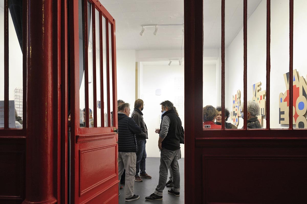
I’m thrilled to be invited for de/cipher! a group exhibition curated by Susannah Cremer-Bermbach in gkg, Bonn (DE). In addition, preparations are now underway for the exhibition to take place in the Netherlands in 2023.
'Cipher' in German means 'digit', 'cipher', 'zero' and 'monogram' and above all a secret writing, the translation of (everyday) language into an encrypted message, a code. The exhibition title 'De/cipher' thus refers to a semiotic interplay between encoding and decoding, and in a more general sense around translation - of lines, shapes, colors, patterns, signs and symbols.
Participants: Marjorie Welish, artist/critic (NY/US), José Heerkens (NL), Johanna Reich (DE), Gracia Khouw.
Also showing artists objects, wall works, books and special editions by Carlo Battisti, Julia Bünnagel, Jochen Gerz, Eugen Gomringer, Keti Kapanadze, Wjm Kok, Joseph Kosuth, Josef Linschinger, Vera Molnar, Franz Mon, Gerhard Rühm, Takako Saito, Timm Ulrichs, Ulrich Wagner and others.
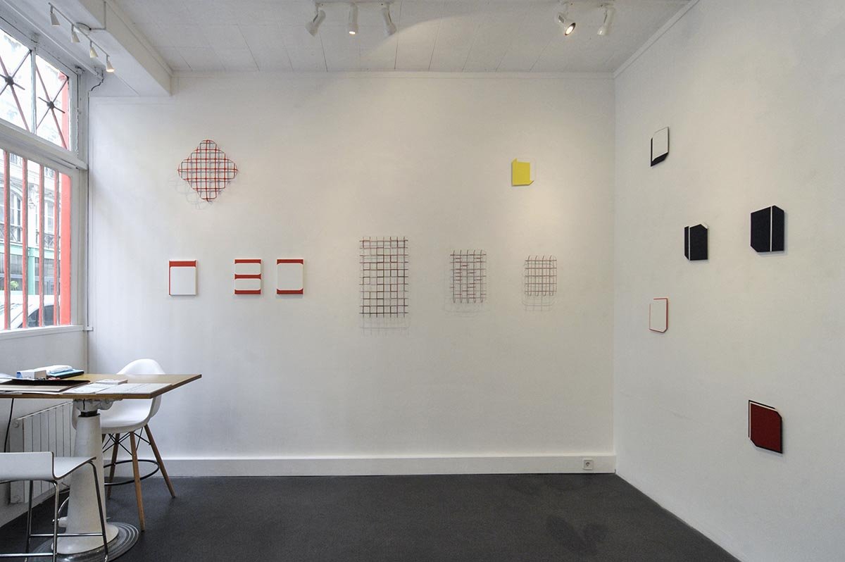
Installation view in gkg Bonn during “Lebt Theo?” 2011, a group exhibition curated by S. Cremer-Bermbach and Christoph Dahlhausen / photo: works by G. Khouw. Krijn de Koning, WJM Kok, Bob Bonies, Piet Tuytel
Link to YEAH page
gkg Bonn (Gesellschaft für Kunst und Gestaltung)
January 22 - April 16, 2023
Hochstadenring 22
53119 Bonn (DE)
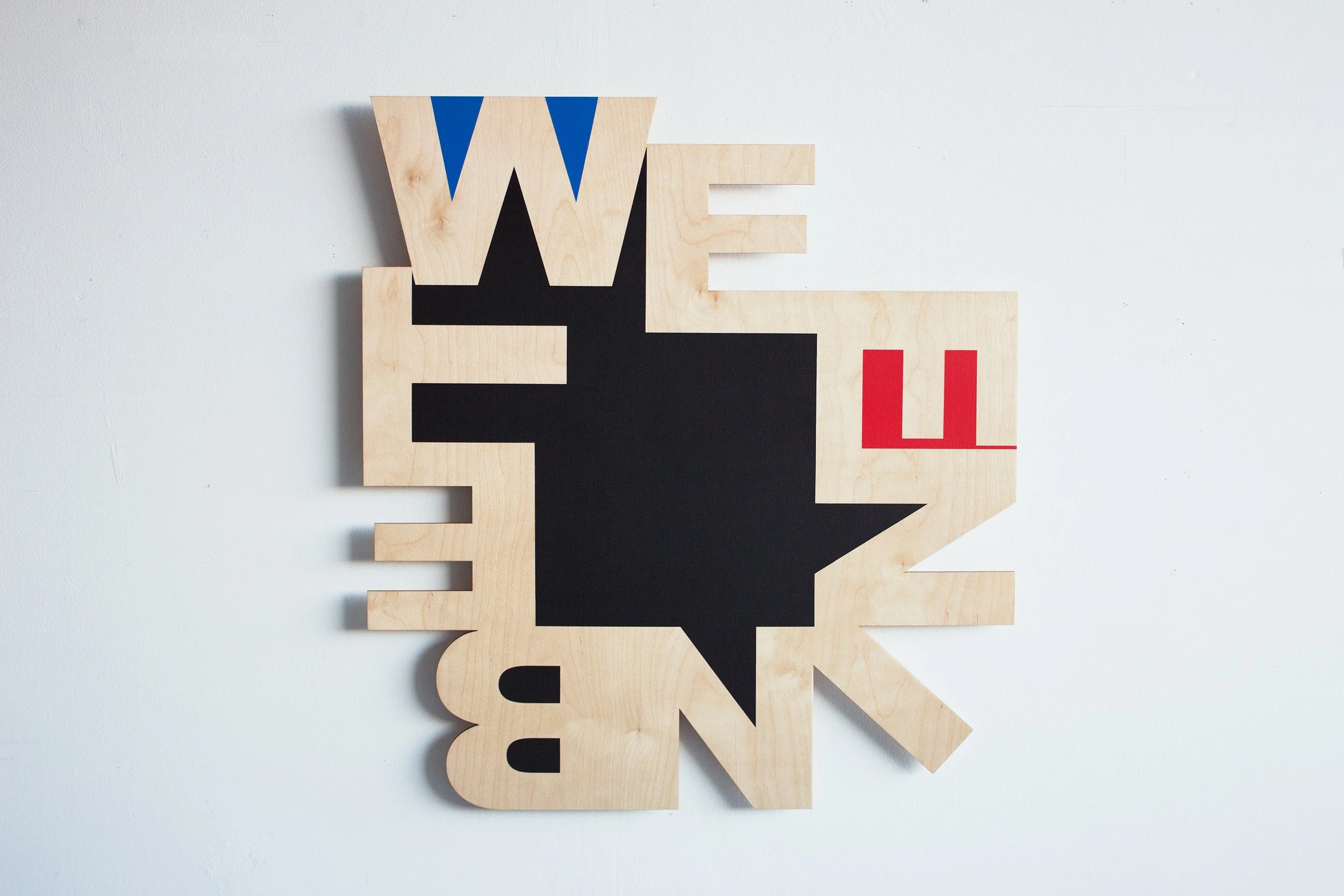
New Work: INBETWEEN series
An introduction to this new series inspired by the so-called "adverbs of place," words that answer the question of where something takes place. Below are a few pictures of the first paintings made in the fall of 2021. More works will follow this spring.


TWEEN (green) 1509 / 35 x 32 cm size (nr. 1)
TWEEN (blue) - 1709 / 35 x 32 cm size (nr. 1)
TWEEN (black) - 2911/ 76,5 x 70 x 2 cm (size nr. 4)
Overview photo: TWEEN (blue) 1909 / 43 x 43 x 2 cm (nr. 2) (sold) and TWEEN (blue) / 54 x 50 x 2 cm (nr. 3)
- the material of the paintings is 6 mm birch plywood. A custom mdf hanging structure is attached to the back so that you can view the work in 4 different positions.
The series are works in edition
- Size nr. 1, nr. 2 are editions of 3
- Size nr. 3, nr. 4 are editions of 2
- Size nr. 5 is unique and is the maximum size at the moment.

LIFE - white - 320 x 320 mm / print on 3 mm plexi glass (sign material)
Happy New Year!
From the studio in Amsterdam, wishing you a Happy New Year

NEW WEBSITE!
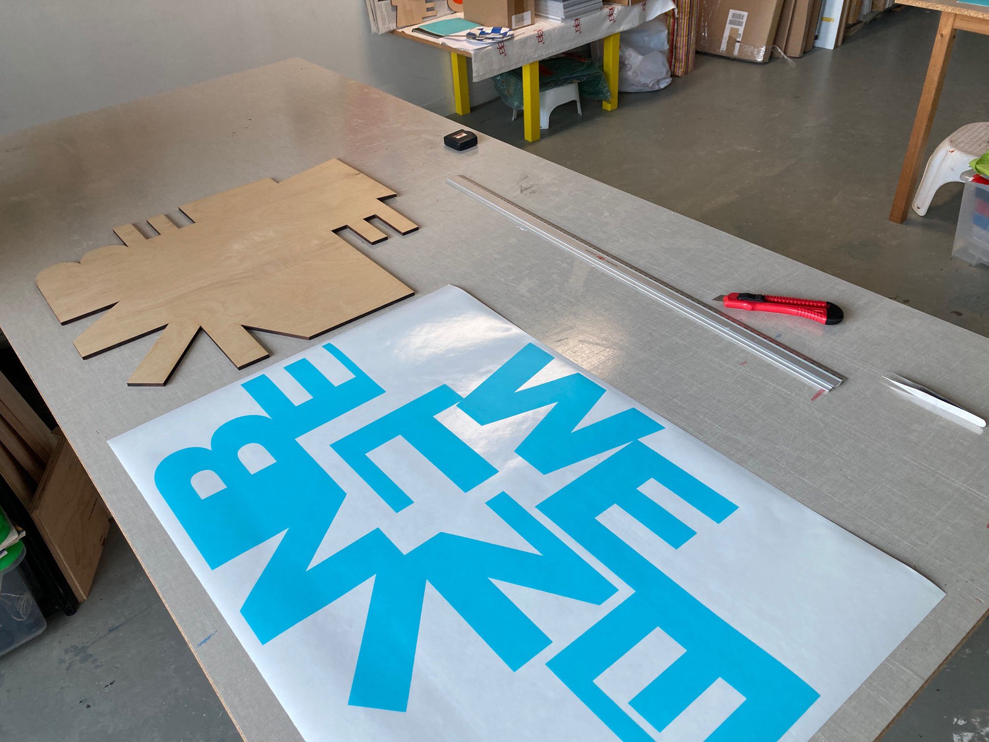
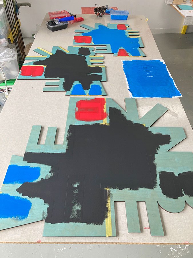
New Series / working title: Adverbs of Place
The making of new series with adverbs of place INBETWEEN, Laser cut birch plywoord 6 mm, sizes nr. 3 - 52 x 58 and nr. 4 - 60 x 77 cm


GREETINGS / LIMITED EDITION CARDS

NL: voor Nederlands, scroll omlaag, of klik op ‘read more’
At the end of the year, we face the beginning of a new year. Time to think about New Year's cards. I have a collection of 6 designs. They can be ordered in sets of 6, you can specify how many of the type of design (or color) you wish to receive.
Order by 30th of November to receive the cards on time.
NL
Aan het eind van het jaar, staan we voor het begin van een nieuw jaar. Tijd om na te denken over nieuwjaarskaarten. Ik heb een collectie van 6 ontwerpen. Ze kunnen per sets van 6 besteld worden, je kunt de set zelf samenstellen met de ontwerpen of kleuren die je wilt hebben.
Bestel s.v.p. vóór 30 november om de kaarten op tijd in huis te hebben.
Images of LA DISTANCE ENTRE DEUX LIGNES DE CROISEMENT/ABSTRACT PROJECT GALLERY
27/10 - 06/11/2021 / Gerda Kruimer + Gracia Khouw / #130
GALLERY ABSTRACT PROJECT
5, rue des immeubles industriels, 75011 Paris (FR)
Images of the exhibition and opening October 27, 2021. Photos: Jun Sato.
About the series ERoverheen page
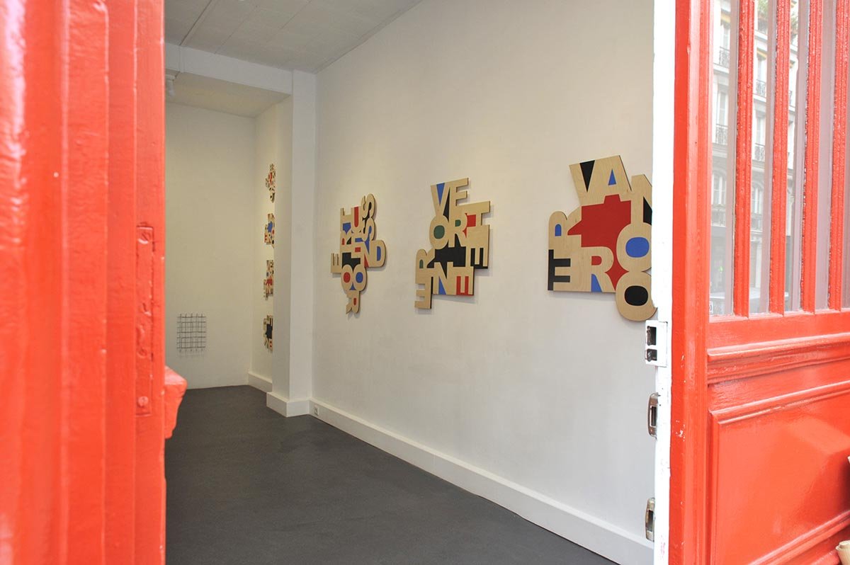
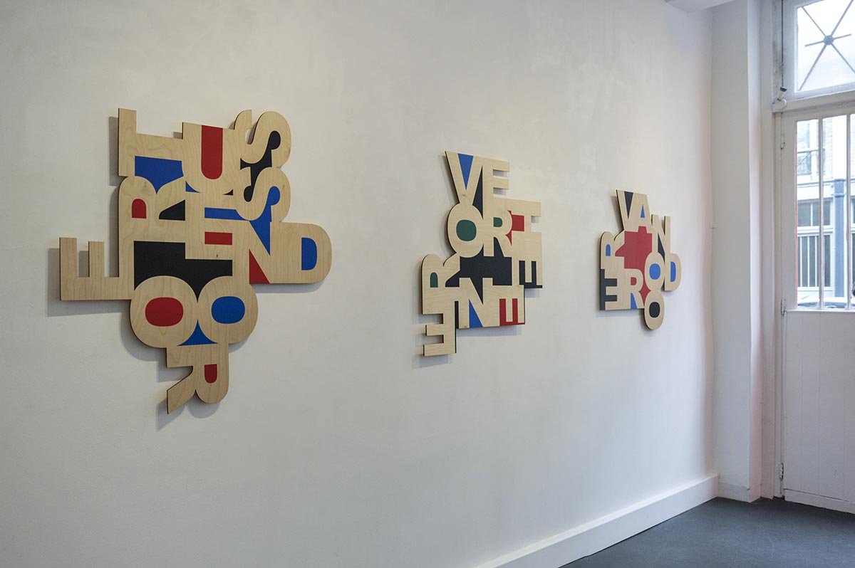
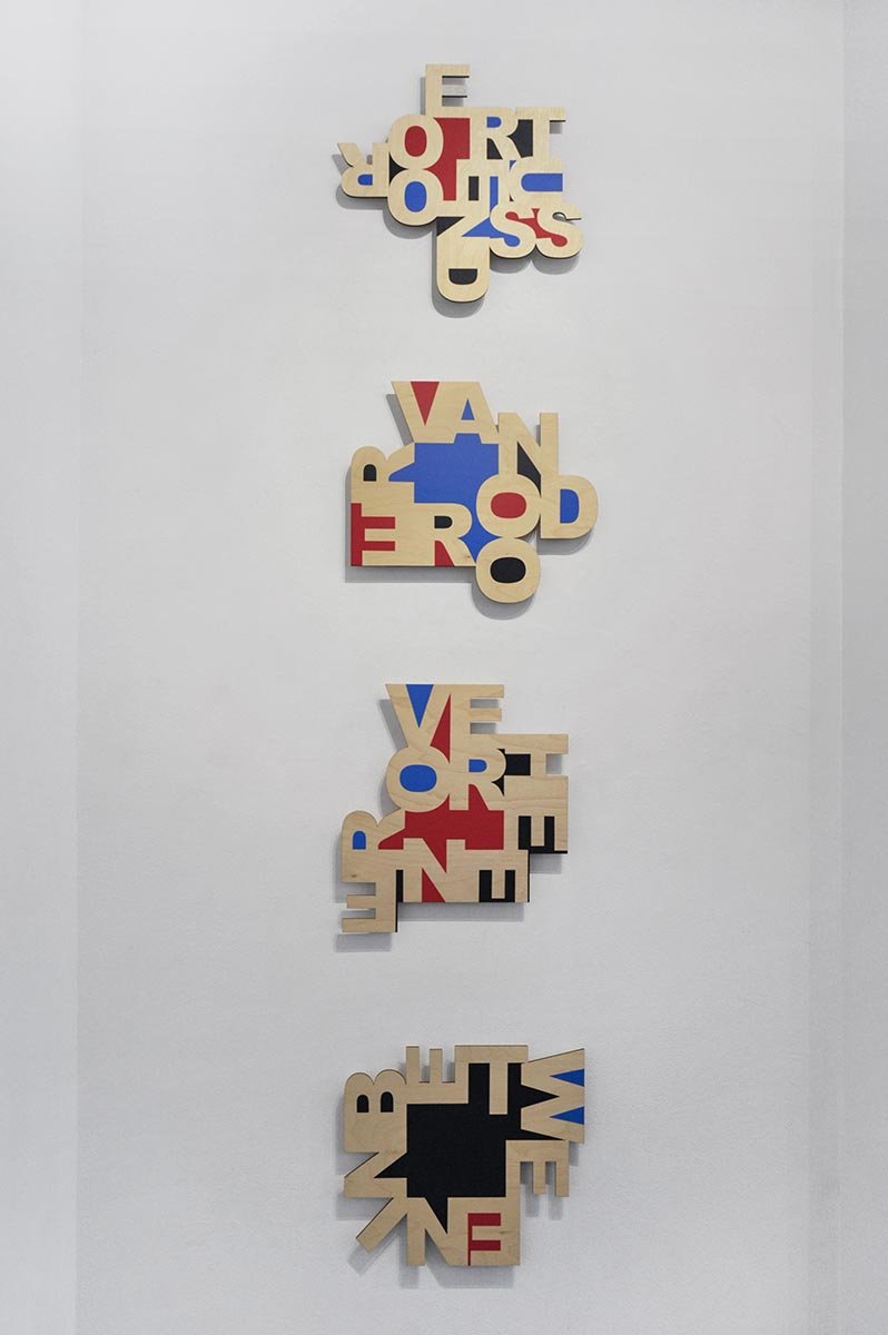
The Distance Between Two Intersecting Lines - October 27 (opening) - November 6

LA DISTANCE ENTRE DEUX LIGNES DE CROISEMENT
>> opening: Wednesday October 27, 18.00-21.00 hrs .. Welcome!
>> artists present at the opening and by appontment >> mail
Gallery Abstract-Project.com
5, rue des immeubles industriels,
75011 Paris, France
> open: Wednesday - Saturday, 14.00 - 19.00 hrs
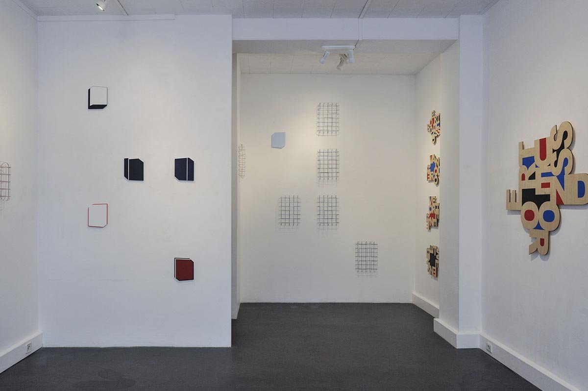
The Distance Between Two Intersecting Lines (part 1) 28/09 - 08/10/2021, ARTSPACE - Arti Et Amicitiae, Amsterdam

OVER (black, green) #0708 - 2020 / 41 x 45 x 2 cm, size 2 / edition of 3 / private collection
The first part of a two person exhibition with works about space, emptiness, residual form and shape in Amsterdam. The next show will be in Abstract Project Gallery in Paris.
ARTSPACE, Sociëteit Arti et Amicitiae
(Society of visual artists)
Rokin 112, Amsterdam
Open on weekdays Monday - Friday, 13.30 - 17.00 hrs
Link Gerda Kruimer
Arti et Amicitiae and its fascinating history is closely linked to its monumental building on the Rokin. Arti presents a topical, experimental, high profile exhibition program which includes both local and international subjects in its central location in the heart of Amsterdam.
https://www.arti.nl/tentoonstelling/gracia-khouw-en-gerda-kruimer/

Accordian-fold prints (leporello) proofs next to a book by Marjorie Welish, June 2021
In Preparation: Project X, First Edition of 2 Accordians
Project X is a collaboration with painter and art critic Marjorie Welish. We’ve been working on our project when Marjorie invited me for a collaborative dialogue in 2019. To start we had agreed on which words we would concentrate on, complex concepts from the book A work, and .../ by Marjorie. Also in addition, I suggested categories of words which have a certain attraction, a more musical association. I selected the words and worked them out into images. Marjorie responded to this with six images with drawings and actions: overlapping and superimposing images.
The images have now been printed, mine here in Amsterdam and Marjorie’s in New York. The giclee prints are folded as accordians (also called ‘lepporellos’ or zig-zag folds) and are brought together in an archival box. They will accompany an exhibition of our collaboration . More information will follow soon.
Link Marjorie Welish

Waar ik nu ben / Huis de Pinto / July 14, 2021
Huis de Pinto / Waar ik nu ben / till end of August 2021
The reading room of House De Pinto has a wide range of magazines and newspapers. The room adjacent to the reading room is a study room with bookcases and also has beautifully painted ceilings. The exchange library is situated there.
Open: Monday till Saturday, 13.30 - 17.00 hrs.
Last day of the wall installation: Tuesday August 31, 2021
Link Huis de Pinto, address: St. Antoniebreestraat 69, Amsterdam,
Location: a 12 minute walk from Amsterdam Central Station - or 1 subway stop to ‘Nieuwmarkt’
Link to project page
FINISSAGE - GEEN DADEN MAAR WOORDEN - 18/7, 15.00 hrs
NOT ACTIONS BUT WORDS >>> Finisage >> Sunday July 18, 15.00 - 17.00 hrs
- Program is in Dutch-
Vrijdag 16, zaterdag 17 en zondag 18 juli zijn de laatste dagen van de tentoonstelling.
Op de allerlaatste dag sluiten we af met een kort en fel programma:
- PJ Roggeband komt spreken over '11-letterige woorden'
- Korrie Besems over 'woorden en enkele zeer korte gedichten'.
- Jan Verhaeghe zal doorlopend zijn performance 'Artbooks by The Censored Censor #2' uitvoeren.
- Onder leiding van Maria Barnas kunnen bezoekers meedoen aan de workshop ‘woordhappen’.
Gratis teras, reserveren niet nodig. Welkom!
Omstand (link)
Van Oldenbarneveldstaat 92 A, Arnhem
open: 12.00- 17.00 uur
(click on the image bellow to view the series)

FIVE FOUR MORE LESS / installation view of 12 images, photo Django van Ardenne / Click on the image
LIKE/LEUK, from the FIVE FOUR, MORE LESS series / GDMW, OMSTAND Arnhem
LIKE 2021 / 64 x 64 x 2 cm / print on plexiglass
For me, LIKE is intrinsically linked to Facebook. So is LEUK in Dutch. It's meant to be affirmative; but there's no room for nuance, such as ' a little like' - a little like. I don't like the word LIKE; while I find LEUK slightly less problematic. I am ambiguous about the significance. Visually, the four capitals have angular and sharp horizontal and vertical lines; I have marked the residual area with diagonal lines. Although the sound is inviting, as if with two arms you want to claim or pull something in for yourself, all the linear strokes repel. LIKE and LEUK are typical cliché words. In a personal conversation, you can't get away with these words; you continue to ask why something is liked. If the person can't explain it, they represent a superficial view of things.
Or would that be true of most four-letter words?
> LIKE is part of GEEN DADEN MAAR WOORDEN exhibition at Omstand, exhibition space for contemporary art, Arnhem - show runs till July 18 > Artist Talk at Finissage on Sunday 18th. Welcome!
>> More images FIVE FOUR, MORE LESS page
LEUK-rood-lichtblauw, 2018
NL
Voor mij is LIKE is onlosmakelijk verbonden met Facebook. Net als LEUK in het Nederlands. Het is positief bedoeld; maar er is geen ruimte voor nuance, zoals ‘een beetje leuk’ - een beetje like. Ik hou niet van het woord LIKE; terwijl ik LEUK iets minder problematisch vind. Ik sta ambigue tegenover de betekenis. Visueel hebben de vier kapitalen hoekige en scherpe horizontale en verticale lijnen; de restvlak heb ik met diagonale lijnen gearceerd. Hoewel de klank uitnodigend is, alsof je met twee armen iets wil claimen of binnenhalen voor jezelf, stoten al die rechte lijnen af. LIKE en LEUK zijn typische cliché woorden. In een persoonlijk gesprek kun je niet wegkomen met deze woorden; je vraagt door waarom iets leuk is. Als degene dat niet kan uitleggen symboliseren ze een oppervlakkige kijk op de dingen.
Of zou dat voor de meeste vierletterwoorden gelden?
GEEN DADEN MAAR WOORDEN - NOT ACTIONS BUT WORDS
LUCK (proof, nr 3), 64 x 64 cm, 3 mm plexiglass

Jan Verhaeghe (BE) photo of detail Censuursculpturen (Censorship sculptures), ongoing series
I’m very excited about this exhibition about the use of words in the visual arts. Language is the connecting factor between the artworks in which words are manipulated, visualized or made audible in a variety of ways.
For this exhibition, I used several words from the collection of four-letter words beginning with the letter L. I now focus more on the centerpiece and keep a square format. Additionally, I‘m experimenting with printing on plexiglass. The clarity and sheen of the plastic material suits the through simplification that the words want to convey. Twelve images on plexiglass are installed in the show, forming a dialogue with the 4 letter words by Gerard Koek.
Link to FIVE FOUR page
June 12 - July 18, 2021
OMSTAND, exhibition space for contemporary art, Van Oldenbarneveldstraat 92 A, Arnhem
Opening: June 12, 16.00 hrs
Also present on Sunday June 27, 14.00 - 17.00 hrs (please rsvp)
>> Many thanks curator Korrie Besems and Rob Groot Zevers, Omstand!
NL
GEEN DADEN MAAR WOORDEN is een groepstentoonstelling over vormen van taal in de beeldende kunst. Taal is de verbindende factor tussen de kunstwerken waarin woorden op uiteenlopende wijze worden bewerkt, verbeeld of hoorbaar worden gemaakt. Van jonge en meer ervaren kunstenaars worden werken getoond die de volle bandbreedte beslaan van hoe taal een beeld kracht bij kan zetten of hoe taal geen beeld meer nodig heeft om een krachtig beeld op te roepen.
Voor deze tentoonstelling heb ik een aantal woorden gebruikt uit de verzameling van vierletterwoorden die beginnen met de letter L. Ik concentreer me nu meer op het middenstuk en houd een vierkant formaat over. Ook ik experimenteer met het printen op plexiglas. De helderheid en de glans van het plastic materiaal past bij de doorgeslagen versimpeling die de woorden willen overbrengen. In de tentoonstelling zijn 12 panelen te zien die in de ruimte een dialoog aangaan met de vierletterwoorden van Gerard Koek.
! UPDATE Huis de Pinto: Waar ik nu ben / Where I am now
Huis de Pinto will reopen on June 9 and the exhibition is extended to September 1 , 2021.
Regular opening hours: Monday - Saturday, 13.30 - 17.00 hrs.
Link to Huis de Pinto
Project page LINK.

An afternoon in Huis de Pinto, november 2020


>> With special thanks to Jacqueline Verhaagen, Maarten Borger, Cuneke Mertens, Herman Feddema, Emma Hogendorp, Tine Sijbesma and Diet Verschoor.
**UPDATE > March 26 > 'THEMA, METHODE, KEUZEVRIJHEID' IN DE ZAAL, DELFT
This exhibition is extended till April 4 and open by appointment.
After the lovely meeting last Sunday March 7, I’ll be in the gallery again on Friday March 26 . Please mail me if you plan to visit in the first (14.00 - 15.30 hrs ) or the second time slot (15.30 - 17.00 hrs).
Welcome!
Click here to view the invitation and the images.
Galerie De Zaal (link)
Koornmarkt 4, NL 2611 EE Delft
T 015-2145913 M 06-24112130

Exhibition overview Galerie De Zaal: works by Guido Lippens, Arie Berkulin, Gracia Khouw / photo Jan-Willem Groenendaal
New page: LIMITED EDITIONS of SITE-SPECIFIC works
in store, sitespecific

XXXL / 2015
giclée print / fine art paper 305 gsm / 59,4 X 42 cm, edition of 8
When requested to design for a specific location, I often offer the blueprint or studies for sale as inkjet prints. Sometimes an exhibition space has little budget and selling prints is a welcome addition to my design budget.
About these prints: they’re are also called piezography or giclée and are printed on archival fine art paper and the ink is fade resistant. Now I've put together a page on which the prints can be seen. Please contact me for information and to order.
LINK Prints Site-Specific Works
NL
Wanneer ik een ontwerp te maak voor een specifieke locatie of tentoonstelling, bied ik vaak daarbij het ontwerp of studies hiervoor als inkjet prints te koop aan. Soms heeft een tentoonstellingsruimte weinig budget en is verkoop van prints een welkome aanvulling op mijn ontwerpbudget.
Over deze prints: ze worden ook piezografie genoemd of giclée; ze zijn op geprint op zuurvrij fine art papier en de inkt is ‘fade resistant’. Nu heb ik een pagina samengesteld waarop de prints te zien zijn. De prints kunnen direct bij mij besteld worden.
LINK Prints Site-Specific Works